The Value Proposition Canvas still works
 Quentin Dupard
The Value Proposition Canvas is twelve years old, it fits on one page, and I still hang it on the wall in most engagements. Not because it contains any answers. Because it forces a company to write down, in separate boxes, what the customer is trying to get done and what the company has built, and the distance between those two lists is usually the whole problem.
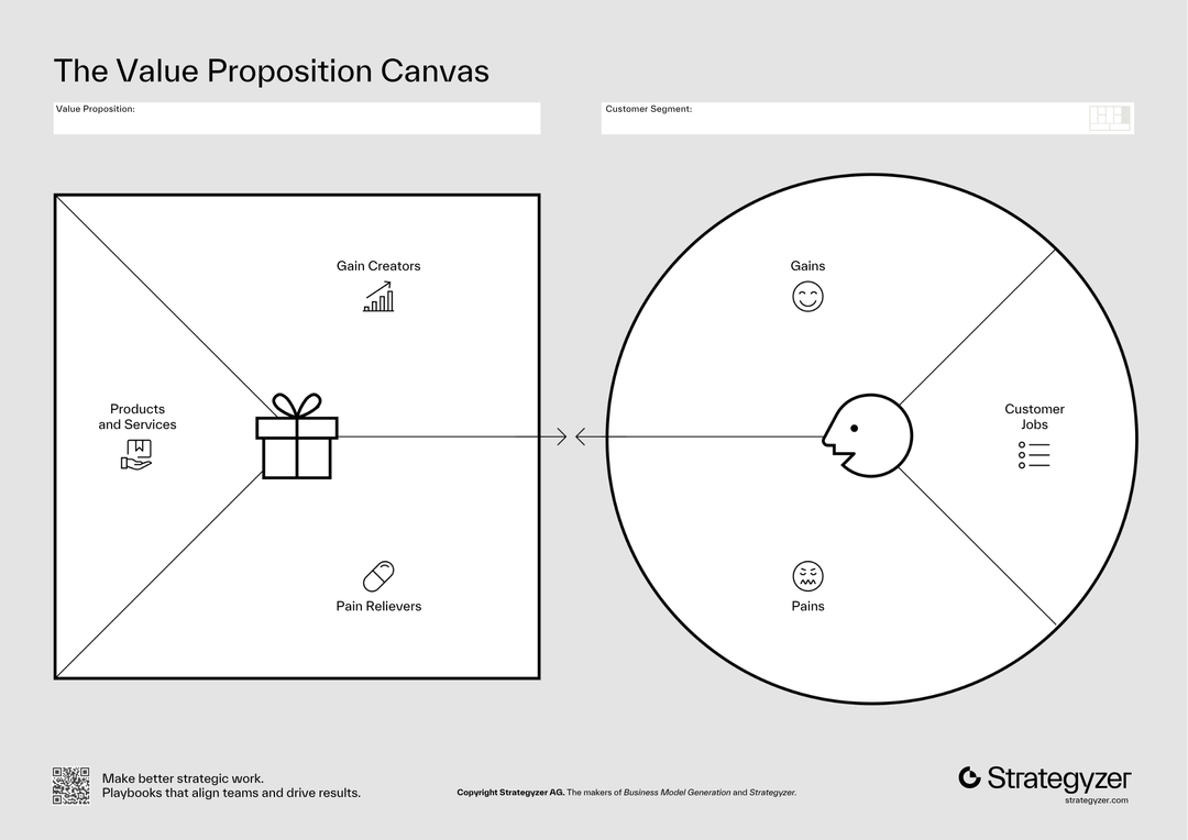
What is the Value Proposition Canvas?
It is the zoom lens for the middle box of the Business Model Canvas. Where the big canvas gives Value Propositions one square, this one gives it a whole page split into two halves. On the right, a circle for the customer: the jobs they are trying to get done, the pains that make those jobs miserable, and the gains they hope for. On the left, a square for you: your products and services, the pain relievers among them, and the gain creators. The exercise is to fill the circle first, from evidence, then fill the square, then look at how badly they match. The authors call a good match fit. Most companies discover they have been designing the square in a room the circle has never entered.
That is the entire tool. No scoring, no sequence of workshops, no certification. Which is exactly why it survived twelve years of framework fashion: there is nothing in it to go out of date, because it contains no advice. It contains questions in a fixed order, and the order is the point. Customer first, offer second, comparison last. Every failed positioning exercise I have been called into ran that order backwards.
Why does a 2014 tool still earn wall space?
Frameworks age in two ways. The ones built on tactics rot with the channel they were built for; nobody needs a growth-hacking playbook from 2014. The ones built on questions barely age at all, because the questions were old to begin with. What is the customer trying to do, what hurts, what would delight them, and which of our claims answers any of it: those questions worked in a market stall. The canvas just pins them to a wall in an order a team cannot squirm out of.
It has also aged into new relevance for a reason the authors could not have planned. Execution keeps getting cheaper; the machines are eating the intelligence work, and what is left over is judgement about what to build and for whom. The canvas is a judgement instrument. It produces nothing a model can verify, automate or generate on your behalf, because its raw material is what your specific customers actually said, ranked by how much it hurt. A tool that old, that cheap, aimed at exactly the work that is not getting cheaper: that is why it stays on the wall.
The three uses that survive contact with clients
As a lie detector for the homepage. Fill the left square from your live website: every claim, feature and adjective goes in as a product, a pain reliever or a gain creator. Fill the right circle from the last ten sales calls or support threads. Then draw the lines. In most audits, half the homepage maps to nothing in the circle, and the two biggest pains in the circle have no line pointing at them. You have just turned a vague copy discussion into a list of sentences to delete and two to write.
As the ranking argument. The boxes are the easy part; teams fill them in an hour. The value is in forcing a rank. One job matters most, one pain hurts most, and the room has to commit, in ink, in front of colleagues. The fights this starts are the most useful meetings I get to referee, because a team that cannot rank its customer's pains has been shipping features by internal politics, and now everyone can see it.
As the test list. Every note in the circle is a claim about people who are not in the room, which means every note is either evidence or a guess. Mark which. The guesses in the pain box are your riskiest assumptions, and each one converts directly into a customer conversation or a landing-page test. This is the same repair I apply to the big canvas: the page cannot tell facts from wishes, so the discipline has to come from you.
Findings for product
- Fill the circle from transcripts, not memory. The customer profile is only worth the evidence under it. Ten recent sales calls, ten support threads, ten churn interviews: quote the customer's own words into the jobs and pains boxes. A circle filled from the team's memory is the square wearing a disguise.
- Weight pains over gains in B2B. The canvas draws pains and gains the same size, but budgets do not. A relieved pain gets bought this quarter; a promised gain gets a follow-up meeting. If your roadmap is mostly gain creators, expect long sales cycles and ask which pains you decided not to solve.
- One canvas per segment, no exceptions. The moment two customer types share a circle, the jobs list becomes an average that describes nobody. If the profiles genuinely differ, you have two canvases and possibly two products; the five segment tests from the parent framework decide which.
- Use the jobs box to find your triggers. A job is what someone hires the product for; the moment the job shows up in their week is where habit gets built. The jobs list feeds directly into trigger design: for each functional job, name the moment it recurs and what fires it.
- Revisit the circle quarterly; it drifts. Customers change faster than the poster on the wall. The jobs stay stable for years, but the pains move with tooling, budgets and whatever your competitors shipped. A canvas from two years ago is a record, not a map.
Product test: read your roadmap's next five items and name, for each, the ranked pain or job it serves. Anything you cannot name in ten seconds is being built for the square, not the circle.
Findings for marketing
- Copy is the line between the halves. Every headline should be traceable to a specific pain reliever or gain creator, which is itself traceable to a ranked pain or job. When a page underperforms, walk it right to left: usually the claim maps to something the team is proud of rather than something the customer ranked.
- Write the pains in the customer's grammar. The pain box should hold the words prospects actually say, and those words are your messaging, your search terms and the questions an answer engine gets asked. The canvas doubles as a keyword-research artefact if you let the quotes stay verbatim.
- Match the offer to the job's moment, not the demographic. Campaigns targeted at who people are compete with everything; campaigns targeted at the moment a job recurs compete only with the current way of doing that job. The circle tells you the moment if you filled it honestly.
- Kill the claims with no line. The fastest positioning work available: delete every sentence on the homepage that maps to nothing in the circle. Pages get shorter and convert better, because the remaining claims stop diluting each other. This is the first hour of most teardowns I run.
- Let the gains write the upsell, not the headline. Gains are real, but they belong in expansion conversations with customers whose pains you already relieved. Leading with aspiration before relief reads as marketing; leading with relief earns the right to promise more.
Marketing test: hand a colleague your homepage and the pain box, and ask them to draw the lines. Every claim without a line is a sentence your customer has to read for nothing.
Where does it break?
It looks finished long before it is true. Like its parent, the canvas is a description tool that photographs beautifully when full of guesses. An afternoon workshop produces a wall that feels like progress and contains no evidence. The tool has no defence against this; the fact-or-guess marking above is not in the book, and it is the difference between a research artefact and team wallpaper.
Ranking is where it lives, and most teams skip it. The printed canvas does not demand an order, so groups happily list eleven pains and treat them as equal. Unranked, the canvas justifies any roadmap, which is precisely why some teams love it. If you take one rule from this page: no canvas is done until the boxes are ranked and initialled.
It is silent on competition and price. Fit between your square and their circle says nothing about the three competitors achieving the same fit, and nothing about what the relief is worth in money. The canvas starts the pricing conversation by naming what is valuable; it cannot finish it. That second half is a different discipline, and mistaking the canvas for it is how teams end up with perfect fit and terrible margins.
The names invite hair-splitting. Teams burn real time debating whether a note is a pain or an ungained gain, a job or a pain. The taxonomy does not matter; the ranking does. Set a two-minute rule on classification arguments and spend the time on order instead.
Who should use it, and when
Use it when the words about the product are about to be written or rewritten: before a homepage rebuild, before a launch, before renaming the tiers, and in the first week of any positioning engagement. Use it after churn interviews, when the pain box can be filled with fresh quotes. Skip it as a standing artefact that gets ceremonially updated; it is a thinking session, not a shrine. And if the team has never met a customer, run the interviews first. The canvas gives an honest team a place to put the truth; it gives an isolated team a beautiful place to put its assumptions, and only one of those is worth the wall space.
The canvas is old the way a checklist is old. Nothing in it will surprise anyone, and teams that use it still ship different products than teams that do not, because writing the customer down in their own words, ranked, is rarer than any new framework.
Common questions
What is the Value Proposition Canvas?
The Value Proposition Canvas is a one-page tool from Value Proposition Design (Osterwalder, Pigneur, Bernarda and Smith, 2014) that zooms into the value proposition box of the Business Model Canvas. It has two halves: a customer profile circle holding the customer's jobs to be done, pains and hoped-for gains, and a value map square holding your products and services, pain relievers and gain creators. The exercise is to fill the circle from customer evidence first, the square second, and then examine how well they match. The authors call a strong match fit.
Is the Value Proposition Canvas still relevant?
The Value Proposition Canvas remains relevant because it is built on questions rather than tactics: what the customer is trying to do, what hurts, and which claims answer any of it. Tactical frameworks rot with their channels; question frameworks barely age. It has also gained relevance as AI makes execution cheap, because the canvas works on exactly the part that is not getting cheaper: judgement about who the product is for and which pain it relieves, grounded in what specific customers actually said.
What is the most common mistake teams make with it?
The most common mistake is filling the customer circle from the team's own memory in a single workshop, which produces the company's assumptions wearing the customer's clothes. The second is skipping the ranking: listing eleven pains as equals lets the canvas justify any roadmap. A canvas is only done when the circle is filled from real transcripts or interviews, every note is marked as evidence or guess, and the boxes are ranked and committed to in front of the team.
How is it different from the Business Model Canvas?
The Business Model Canvas describes a whole business in nine blocks: segments, value propositions, channels, relationships, revenues, resources, activities, partnerships and costs. The Value Proposition Canvas takes just two of those blocks, the customer segment and the value proposition, and expands them into a full page so the match between them can be examined in detail. In practice the big canvas shows a team whether they agree on what the business is, and the value proposition canvas shows whether the offer answers anything the customer ranked as painful.
Can the Value Proposition Canvas help with pricing and messaging?
It helps with both, as the starting half of each job. For messaging, every homepage claim should trace to a pain reliever or gain creator that answers a ranked pain or job; claims with no line to the customer circle are candidates for deletion. For pricing, the ranked pains name what the relief is worth talking about, but the canvas says nothing about what that relief is worth in money or how competitors price the same fit. It opens the pricing conversation and cannot finish it.